One of the most powerful things about Looker Studio is the ability to share a link to anyone who needs access to view the data. This is similar to Google Drive, where you can share to a specific user, or make the document available to “Anyone with the link.” This doesn’t make the document or report findable on the internet, but it does mean that our clients can share their reports with any relevant stakeholders by simply sending them a link.
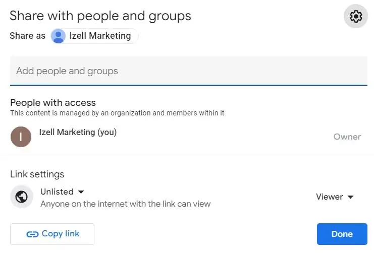
Managing access across digital marketing assets is not easy, and sometimes our clients want someone to be able to see certain summary data without having full permissions to make changes within all the ads and analytics accounts. This is a great workaround for a situation like that. We create the reports using our credentials to each platform, which makes the selected visualized data visible to anyone with view access to the dashboard, and they don’t have to hunt down a password or navigate granting access to each stakeholder each time they want to check on performance.
We also love how we can show data from multiple sources with just one link. This is so much easier for clients than logging into each ad or analytics platform and trying to understand which metrics answer their burning questions. We know they’re busy running their businesses, and we want to take that off their plate with specific and clear reporting that answers their questions in real-time while filtering out the noise.
Not only can you make charts using different platform data, you can also blend data from multiple sources in the same charts.
We like to use this in our clients’ executive summaries. While we get pretty detailed throughout the rest of the dashboards, we blend all data into a summary page where we can analyze sum totals, average KPIs, and trend lines of things like ad spend, conversions, clicks, cost per click, cost per conversion, ROAS, and the list goes on!
We work with our clients to identify appropriate KPIs for their business and visualize them in useful ways. Our clients can then print or share their executive summary and be prepared for board meetings, investor meetings, or meetings with their bosses, and those who ARE the boss are able to keep an eye on the big picture.
This ROAS chart blends spend data from Meta Ads, Google Ads, and purchase revenue from Google Analytics into a trend line.
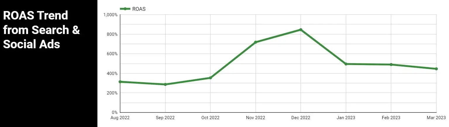
We also love to use the text block feature to define and give context to these metrics, since we know most of our clients don’t have time to decipher marketing jargon or try to understand how their data might compare against industry benchmarks. This section shows the summed ad spend from both Google and Meta Ads, as well as a custom calculated ROAS over all time. Context is also given for any industry averages used for benchmarking.

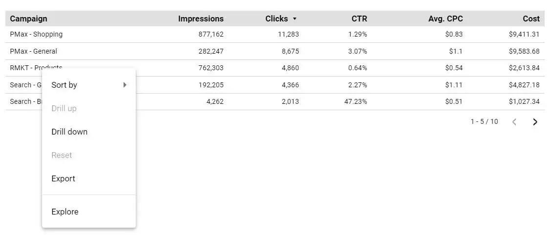
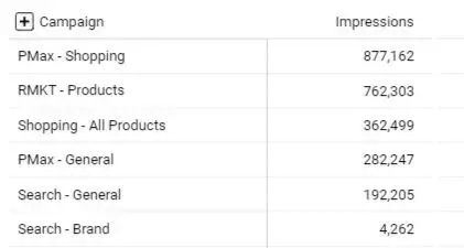
Another great feature of Google Data Studio is the ability to add additional dimensions and metrics. You can transform existing fields to be more useful for you based on various logic or formulas.
We do this most frequently with CASE statements. CASE statements use if/then logic to group data based on what values are in an existing dimension. This allows us to create custom categories which we then use to group campaigns by marketing strategy, product/service categories, or any other useful categorization.
In the example below for a higher education client, we grouped campaigns based on the targeted program, then further split them out based on whether they were targeting potential students within the US or internationally. Since we used a consistent naming convention for the campaign names, we were able to use CASE statements to detect patterns and assign custom dimensions for Program and Geographical Targeting based on the campaign’s name. This aggregation resulted in more streamlined summary reporting for our client.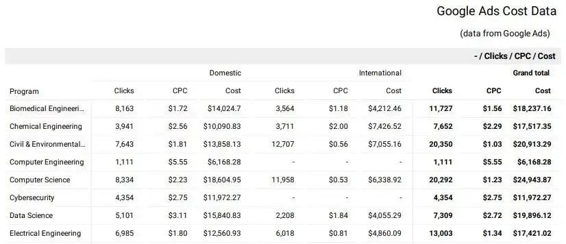
Another way we use this is to translate more technical values into a label that is actually meaningful to those reading the report. For example, Google Analytics has event naming recommendations that aren’t always meaningful to every report viewer. A quick CASE statement transforms this chart:
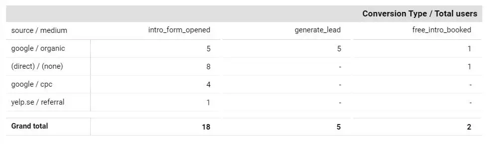 into this chart:
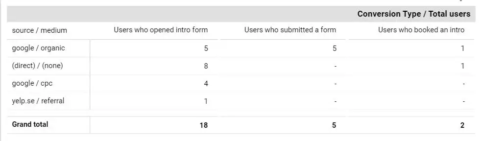
While the difference might seem small, we like to take every opportunity to reduce confusion for our clients. When we hear that our clients have a question about how to read a report or what a certain chart or label means, we make a change to clarify it for them so they aren’t wasting any of their valuable time.
While we believe that the most transparent and honest reporting is typically best achieved with the simplest visualizations, sometimes a fancy visualization is needed to effectively tell the story of a specific set of data.
Looker Studio has a section for Community Visualizations where community partners can create their own custom visualizations, and these can be pretty complex and specific.
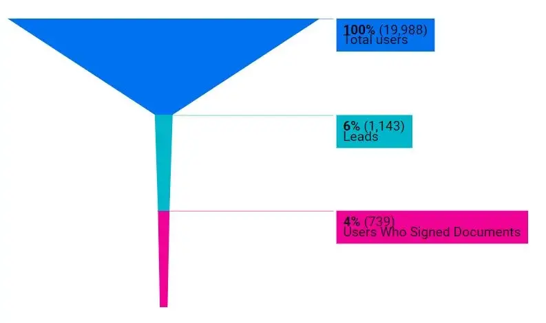
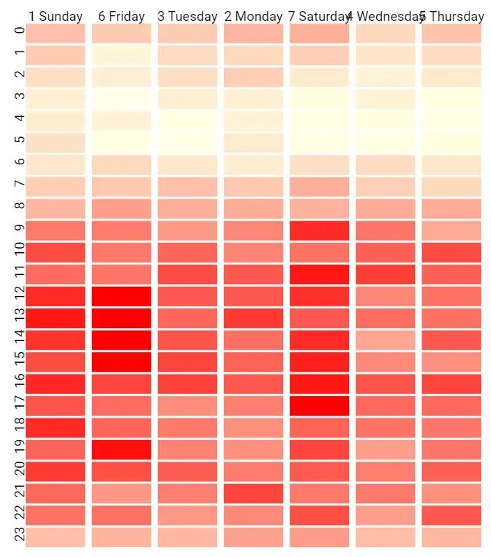
Our favorites are Metric Funnel and Heatmap.
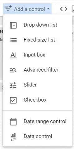
Charts in Looker Studio can be made interactive. To allow our clients to examine the reporting across various date ranges, we include a date selector on most pages. Depending on our client’s business needs, we also sometimes add dropdown filter selectors, drill-downs, or expansions. When combined with custom categories created with a CASE statement, this can be very useful for summarizing high level information while still allowing a detailed view if desired.